
Paint Color Trends Shaping Toronto Homes in 2024
Toronto homeowners are embracing sophisticated, nature-inspired colors that create calm, inviting spaces. Here's what we're seeing in homes across the GTA.
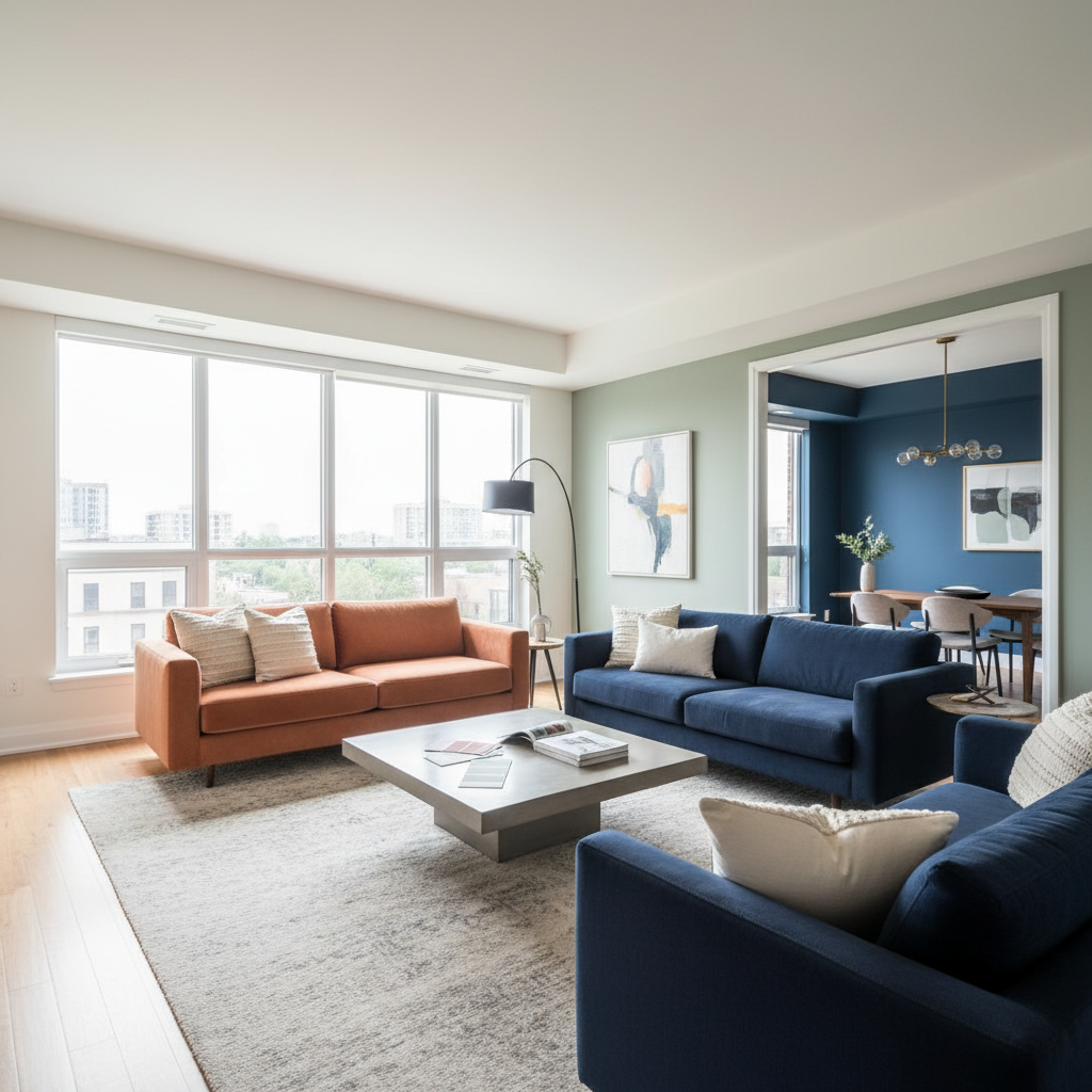
Trending Color Families
Warm Neutrals Continue to Dominate
Greige (gray-beige hybrids) remain the most popular choice for Toronto homes. These versatile colors work with any décor style and provide a sophisticated neutral backdrop.
Popular Warm Neutrals:
- Benjamin Moore “Edgecomb Gray”
- Sherwin Williams “Accessible Beige”
- Benjamin Moore “Classic Gray”
- Sherwin Williams “Agreeable Gray”
Earth Tones and Natural Hues
Torontonians are bringing the outdoors in with:
Sage Greens: Soft, muted greens create tranquil spaces perfect for bedrooms and living areas. Color psychology research links green tones to reduced stress and improved focus — a significant draw for busy urban homeowners.
Terracotta and Clay: Warm, earthy oranges and reds add personality to dining rooms and accent walls
Warm Browns: Rich, chocolate and caramel tones create cozy, grounded spaces
Bold Accent Colors
While neutral walls dominate, Toronto homeowners are getting adventurous with:
Navy and Deep Blues: Creating dramatic, sophisticated spaces in home offices and dining rooms
Forest and Emerald Greens: Bold yet classic, perfect for feature walls
Charcoal and Black: Used strategically on accent walls or to create contrast
Colors Going Out of Style
Gray Overload: While gray isn’t disappearing, the cold, stark grays of the 2010s are being replaced by warmer tones
Bright Whites: Harsh, sterile whites are giving way to warmer off-whites and creams
Purple and Lavender: Once trendy for bedrooms, now dated
Yellow: Bright yellows have fallen out of favor, though warm honey tones remain acceptable
Color of the Year Picks
Major paint brands set the direction each year. Benjamin Moore’s Color of the Year and Sherwin Williams’ Color of the Year are both strong indicators of where residential design is heading. These picks influence everything from furniture to flooring — not just wall paint.
Color Psychology: Choosing Colors for Different Rooms
Living Rooms
Opt for warm, welcoming colors that encourage conversation and relaxation. Warm grays, beiges, and soft greens work beautifully.
Bedrooms
Calming, restful colors promote better sleep. The Sleep Foundation notes that bedroom colour and environment directly influence sleep quality. Soft blues, sage greens, and warm neutrals are ideal.
Kitchens
Light, bright colors make spaces feel larger and cleaner. Off-whites, light grays, and soft greiges are popular.
Bathrooms
Spa-like colors create retreat vibes. Soft blues, greens, and warm whites are trending.
Home Offices
Colors that promote focus and creativity include navy blues, sage greens, and sophisticated neutrals.
Toronto-Specific Color Considerations
Natural Light Varies by Season
Toronto’s dramatic seasonal light changes mean colors look different in winter versus summer. Always test samples in your specific space. Benjamin Moore’s guide to testing paint samples recommends painting large swatches on multiple walls and observing them at different times of day.
South-Facing vs. North-Facing Rooms
South-facing rooms in Toronto receive warm, bright natural light — cooler colors like blues and greens work well to balance the warmth.
North-facing rooms get cooler, bluer light — opt for warmer tones (creams, warm grays, blush) to counteract the coolness.
Toronto’s Architecture and Style
Different Toronto neighbourhoods have distinct character:
- Victorian homes (Cabbagetown, Annex): Rich, heritage-inspired colours — deep greens, burgundies, warm creams
- Mid-century (Don Mills, Etobicoke): Clean, sophisticated palettes with pops of colour
- Modern condos (Harbourfront, King West): Minimalist neutrals with bold accents
- Suburban homes (Markham, Vaughan): Versatile greiges and warm neutrals
How Color Affects Toronto Home Values
The colours you choose can impact your property’s resale value. A Zillow analysis of home sales found that certain paint colours can increase — or decrease — a home’s sale price by thousands of dollars. Neutral and light tones generally perform best for resale in competitive markets like Toronto.
Working with Color in Small Spaces
Toronto condos and smaller homes benefit from thoughtful color strategies:
- Light colors visually expand spaces
- Monochromatic schemes (varying shades of one color) create flow
- Bold ceilings draw the eye up and add unexpected drama
- Consistent colors through open-concept spaces prevent visual fragmentation
Tips for Choosing Your Perfect Color
- Test Before Committing: Paint large samples (at least 2' x 2') on your walls
- Consider Lighting: Colors shift dramatically in natural vs. artificial light
- Look at Undertones: Every neutral has undertones (pink, yellow, green, blue)
- Use the 60-30-10 Rule: 60% dominant color, 30% secondary, 10% accent
- Don’t Follow Trends Blindly: Choose what makes you happy long-term
DC Painting’s Color Consultation Service
Not sure which colours are right for your Toronto home? We offer complimentary colour advice as part of every project. With 10+ years of painting Toronto homes, we’ve seen what works in different neighbourhoods, lighting conditions, and architectural styles.
Ready to update your Toronto home’s color palette? Contact DC Painting for a free estimate and colour consultation.